Tag Archives: Greenland

Antarctic images

In this post I’ve included a series of explanatory images of the Antarctic in order to assist understanding the peril we are in from changes there, and why the Antarctic is going to be central to the climate change story over the coming centuries. What happens to the grandchildren of those who are children now is the big concern. In large part these images relate to items 2-4 of Climate clippings 96.

The first shows the giant vortex of winds, the strongest for at least 1000 years, ripping around Antarctica in a tight circle:
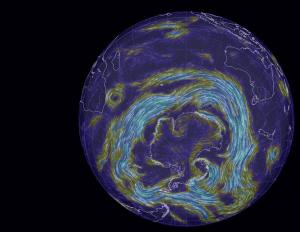
Figure 1
Figure 1

These winds draw rain away from southern Australia, and isolate Antarctica to some extent in terms of atmospheric warming. But they also churn up the ocean, leading to deeper mixing of heat and greenhouse gases.

Both the deep and the shallow formations of the thermohaline circulation system wrap themselves around the Antarctic:
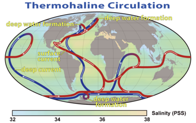
Figure 2
Figure 2

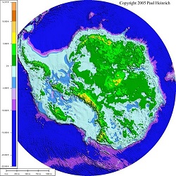
One way or another warm water is penetrating through to Antarctica. The underlying topography of Antarctica reveals much of the land lying below sea level:
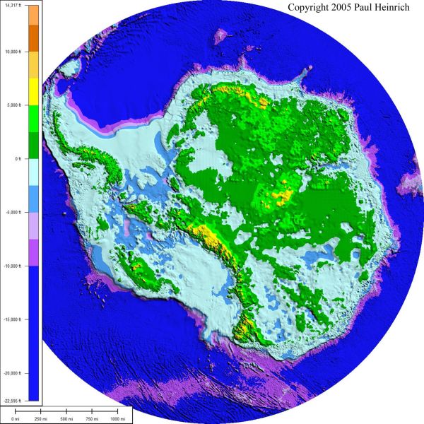
Figure 3
Figure 3

The borderline between blue and green marks sea level. Warmer water is coming directly into contact with the ice sheet and chewing away at the bottom of the ice shelves which form plugs holding up vast quantities of ice in the glaciers stretching hundreds of kilometres inland. The following image shows how the continent drains:
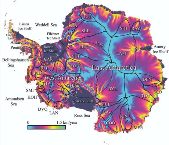
Figure 4
Figure 4

There is concern now that West Antarctica has tipped and with East Antarctica also more vulnerable than previously thought, sea level rise of some metres is now inevitable even if we were to somehow instantly curb greenhouse emissions.

Greenland is quite a different problem. For starters the underlying topography is saucer shaped, with glaciers exiting to the sea through ‘gates’. This image shows the topography:
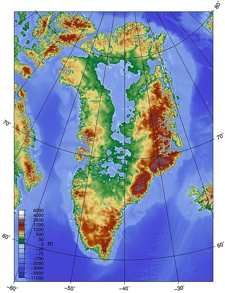
Figure 5
Figure 5

Greenland melts very much from the surface, so its largely a matter of meltwater penetrating, indeed plunging at times, through the surface to the rock below and glaciers speeding up. This image shows some people standing where I’d never stand:
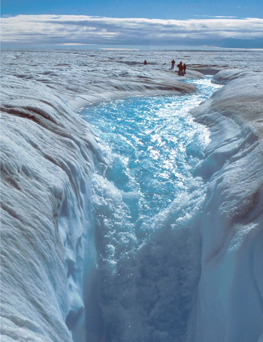
Figure 6
Figure 6

This image shows melting covering the entire Greenland ice sheet for a few days in 2012:
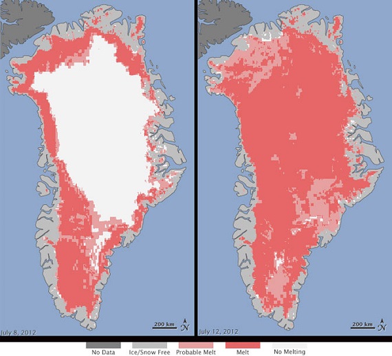
Figure 7
Figure 7

The panel on the left shows a more typical summer melt pattern, which is advancing noticeably over short time frames of a few years.

In the Antarctic, this image shows surface warming over the period 1981-2007:
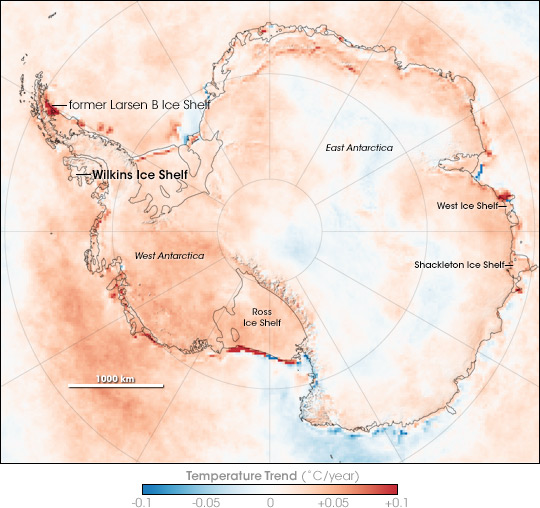
Figure 8
Figure 8

But with the average temperature around -39°C on the East Antarctic ice sheet, which is four kilometres high, that huge lump of ice is relatively stable. This image from NASA in 2005 shows significant perimeter surface melting around East Antarctica:
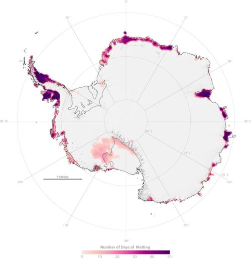
Figure 9
Figure 9

The new research sees concern that warmer sea waters may destabilise the ice further inland than previously thought. Match the red blobs on East Antarctica with the drainage map at Figure 4.

Of some some concern and some comfort is the Andrill Project which found that “the West Antarctic ice sheet has collapsed and regrown over 60 times in the past few million years”. This image shows what happened about a million years ago over a 12,000 year period:
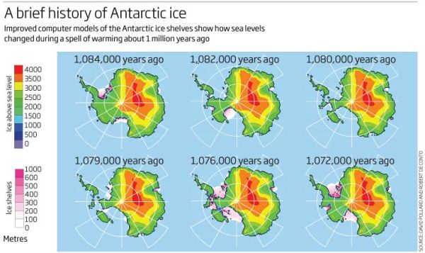
Figure 10
Figure 10

Concern because the Andrill research shows what can happen with mild orbital forcing (the Milankovitch cycles) as the main driver. I understand that CO2 concentration back then was only 400 to 450 ppm, which is where we now, implying that we are already committed to wasting the West Antarctica ice sheet. There is some comfort, however, that a change in the orbital forcing, which is far weaker than what we are doing now, arrested the melt in West Antarctica and brought the ice sheet back again. There was no tipping point which saw the whole East Antarctic sheet disappear.

For perspective I’ll post one of my favourites, a graph from David Archer in 2006 showing the broad relationship between temperature and sea level:
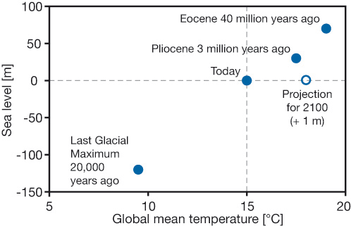
Figure 11
Figure 11

Do not connect the dots with straight lines. Most importantly, I think we now stand at the upper level of a 2°C interval where the sea level did not change much. The NH continental ice sheets had disappeared and the remaining ones – Antarctica, Greenland and the Arctic – were not seriously in play. Even now the main sources of sea level rise lie elsewhere. This table (13.1 from the IPCC5 WG1 Technical Summary) shows what’s happening:
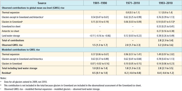
Figure 12
Figure 12

That’s hard to read, so here are the figures for the average annual expansion for 1993-2010:

    Thermal expansion – 1.1mm

    Glaciers except Greenland and Antarctica – 0.76mm

    Glaciers in Greenland – 0.10mm

    Greenland ice sheet – 0.33mm

    Antarctic ice sheet – 0.27mm

With 4-5°C we can expect complete deglaciation and 75 to 80m sea level rise, made up of East Antarctica 59m, Greenland 6-7m, West Antarctica 5-6m, other glaciers and ice caps about 0.5m and thermal expansion, I don’t know, but I think in single figures. Greenland and Antarctica are accelerating rapidly and some time this century will become the top two contributors. These graphs from Skeptical Science are instructive:
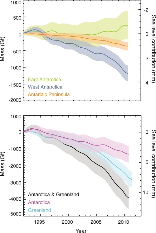
Figure 13
Figure 13

Greenland and West Antarctica are in a death spiral of accelerating ice sheet decay. It’s happened 60 or more time before in recent paleo history. West Antarctica, being more vulnerable may overtake Greenland.

One could say from this that East Antarctica is not yet in play, but science seems to suggest it is not far away.

When ice sheet decay gets going Hansen sees it as possibly progressing in geometric fashion, producing a curve like this:
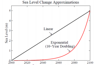
Figure 14
Figure 14

My thinking is that East Antarctica will tip sometime in the next decade, and that ice sheets will decay from there in a pattern that is more exponential than linear. Hansen’s scenario, which he puts forward as a serious possibility, does not look crazy.

I suspect that we are already committed to double digit sea level rise, and there’s not a thing we can do to prevent it; the question is when will it happen? We can only adapt and minimise.

I suspect also that things will go seriously pear-shaped during the latter part of this century. Pity our grandchildren’s grandchildren.

Update: There is a short ABC video news item about the Antarctic ice melt doubling since the last survey. At the end it says the process could take 1000 years. For a complete melt that would be lightning fast – 7.5 to 8 metres per century, or a metre every 12-13 years. We are pushing the system more than 10 times faster than it has ever been pushed before.

See also Gareth Renownden Goodbye coastline: we are beyond the point of no return.

Climate clippings 83

Climate clippings_175These posts are intended to share information and ideas about climate change and hence act as an open thread. Again I do not want to spend time in comments rehashing whether human activity causes climate change.

This edition contains items, exclusively, I think, in climate science and impacts. The thread is meant to function also as a roundtable to share information and ideas.

1. Climate change picked the crops we eat today

The New Scientist carries a story about how some cereals we know today were changed by the climate as we came out of the last ice age. Researchers at the University of Sheffield, UK took seeds of precursors of modern wheat and barley found with human remains in a 23,000-year-old archaeological site in Israel. They grew these together with four wild grass species that aren’t eaten today, but were also known to grow in the region at that time, and grew them under conditions replicating levels of CO2 then and also the higher levels when farming first arose 10,000 years ago.

All the plants grew larger under the higher levels of CO2, but the relatives of wheat and barley grew twice as large and produced double the seeds. This suggests the species are especially sensitive to high levels of CO2, making them the best choice for cultivation after the last ice age.

The team plan to look at whether other food staples around the world are similarly affected by elevated CO2 levels, for example millet grown in Asia and maize in North America. They also plan to compare the effects of CO2 on legumes such as peas. Continue reading Climate clippings 83

Climate clippings 73

In this edition I’ve stuck to scientific articles, and, incidentally have used a couple (items 3 and 4) from stuff I gathered around this time last year when I thought I might be launching a new blog. For reasons we won’t go into it didn’t happen at that time.

1. Arctic ice watch

While we were on sabbatical last year the northern cryosphere had an exciting time. There was a giant storm in the Arctic ocean, Greenland surface melt covered virtually the whole ice sheet and all sorts of records were broken in the Arctic summer sea ice melt. I’m hoping to do an update to catch us up, but follow this link to see a dramatic animation of Arctic sea ice volume loss since 1979. I’ve posted this image to show how far we’ve come:

volume-comparison-1979-2012-v4

You can monitor Arctic sea ice extent on the NSIDC site. This image is a screenshot from the interactive graph on that page showing the way summer sea ice is sagging:

Sea ice extent_cropped_580 Continue reading Climate clippings 73

Climate clippings 48

Greenland ice loss

The rate continues to accelerate, according to Skeptical Science.

It looks ugly, but see comment 24 and the correction @ 27. Doubling the rate each decade will give you 3,200 gt each year by 2050. But that’s still only a bit less than 9mm pa of sea level rise, according to my calculations. Concerning, certainly, but not yet catastrophic. Continue reading Climate clippings 48

Climate clippings 45

Arctic ice

Let’s get this one over with. Arctic ice seems to have bottomed out on 9 September, about two weeks earlier than usual. 2011 was the second lowest on record by a thin margin. I’ll freeze the graph here for the record:

Arctic ice extent

Here’s the important bit:

The last five years (2007 to 2011) have been the five lowest extents in the continuous satellite record, which extends back to 1979. While the record low year of 2007 was marked by a combination of weather conditions that favored ice loss (including clearer skies, favorable wind patterns, and warm temperatures), this year has shown more typical weather patterns but continued warmth over the Arctic. This supports the idea that the Arctic sea ice cover is continuing to thin. (Emphasis added)

Continue reading Climate clippings 45

Climate clippings 40

German electric vehicle goes 1,014 miles (1,631.5 kilometres) on a charge

That’s the Schluckspecht E developed at Offenburg University of Applied Sciences in collaboration with Frauenhofter Institute for Transportation and Infrastructure Systems.

The electric vehicle sports extremely aerodynamic bodywork, two hub-mounted electric motors and an optimized battery management system that evenly divides the load among 14 individual lithium-cobalt battery packs.

More vapourware from Germany? Perhaps, but something good will surely come from it. Continue reading Climate clippings 40

Climate clippings 13

These posts include a brief mention of a number of news items relating to climate change. They don’t preclude treating any of these topics at more length in a separate post.

They can also serve as an open thread so that we can keep each other informed on important climate news.

Hansen and Sato say that limiting human-made warming to 2°C and CO2 to 450 ppm is a prescription for disaster

They say we could be looking at sea level rise of up to 5 metres by 2100.

There are posts at Climate Progress and treehugger but you are better off reading the abstract of the draft paper itself. Then cop this:

Perhaps the most striking characteristic of Pliocene climate reconstructions is that low latitude ocean temperatures were very similar to temperatures today. High latitudes were much warmer than today, the ice sheets smaller, and sea level about 25 m higher (Dowsett et al., 2009 and references therein). Atmospheric CO2 amount in the Pliocene is poorly known, but a typical assumption, based on a variety of imprecise proxies, is 380 ppm (Raymo et al., 1996).

We conclude that Pliocene temperatures probably were no more than 1-2°C warmer on global average than peak Holocene temperature.

But it was considerably warmer at the poles, with consequent loss of ice sheets bulk. The effect is sometimes known as polar amplification. This involves a strong albedo feedback which could produce a doubling of ice loss every 10 years. The cumulative effect is shown in this graph: Continue reading Climate clippings 13

Climate clippings 11

These posts include a brief mention of a number of news items relating to climate change. They don’t preclude treating any of these topics at more length in a separate post.

They can also serve as an open thread so that we can keep each other informed on important climate news.

The world’s reefs are in serious danger

Last December Charlie Veron said:

Reefs are the ocean’s canaries and we must hear their call. This call is not just for themselves, for the other great ecosystems of the ocean stand behind reefs like a row of dominoes. If coral reefs fail, the rest will follow in rapid succession, and the Sixth Mass Extinction will be upon us — and will be of our making.

Now at Climate Progress we are told that the current season looks like the second worst on record. This is how the Australian sea surface temperature has been going;

Australian sea surface temperature

Looks inexorable.

If ocean temperatures and ocean acidity continue to rise in Australian waters at the same pace as has occurred over the past 100 years, the Great Barrier Reef will be in significant danger by 2050.

See also Skeptical Science. Continue reading Climate clippings 11

Climate clippings 7

These posts include a brief mention of a number of news items relating to climate change. They don’t preclude treating any of these topics at more length in a separate post.

They can also serve as an open thread so that we can keep each other informed on important climate news.

November turns out to be the hottest on record

I thought that with a La Nina, November temperatures would turn out to be cooler than 2005 on the NASA GISS record. Turns out they were the hottest on record. Here are some images from the post:

The graph for 2010:

Temperature anomaly graph 2010

Continue reading Climate clippings 7

Climate clippings 3

It’s been almost a year since Climate clippings 2. Shall I say that intentions are good now, as they always have been.

I have included a brief mention of a number of news items relating to climate change. It doesn’t preclude treating any of these topics at more length in a separate post.

It can also serve as an open thread so that we can keep each other informed of important climate news.

Continue reading Climate clippings 3