First graph
Greta Thunberg, the girl who can’t quit, said:
- The emissions are increasing and that is the only thing that matters.
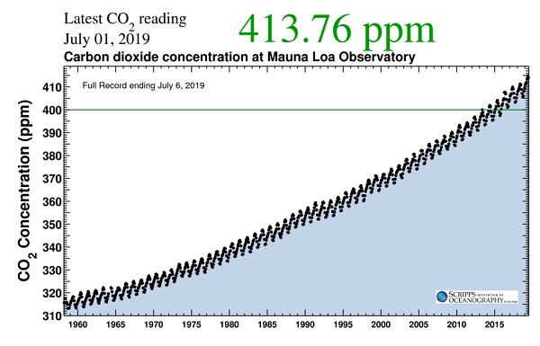
This is what was shown for July 01, 2019 at Muana Loa:
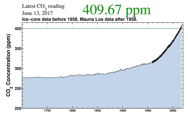
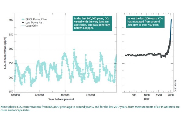
For perspective, this one from 2017 shows what has happened since 1700:
This one shows the ice core record, going back 800,000 years:
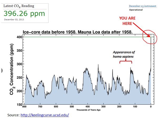
What we’ve got now is outside human experience. It’s also a worry that during the last interglacial, the Eemian, sea levels were 6-9 metres higher than now with only 300 ppm.
You can check out Cape Grim, or NASA, the story is the same.
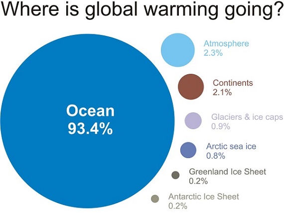
As any primer on climate change will tell, the sun’s radiation comes in via a strong short wave, which punches through the atmosphere, but heat is emitted, mostly overnight, via a weaker long wave, which is more likely to be captured by CO2 molecules. They re-radiate the heat 360 degrees, so some of it is radiated back to the earth. Over 90 per cent of the heat ends up in the ocean:
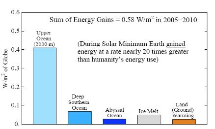
James Hansen tells us in Climate Change in a Nutshell that the earth’s energy imbalance was measured as 0.75 ± 0.25 W/m2 from 2006-2016. That is less than a Christmas light bulb per square metre over the entire planet’s surface. However, Hansen does the maths, and it is equivalent to 400,000 Hiroshima atomic bombs per day, 365 days per year.
This is how he saw the excess energy being absorbed during 2005-10:
Second graph
The second graph to watch is how energy is accumulating in the ocean. I don’t know of a constantly updated source, but this one shows what has happened in the upper 700 metres of the ocean in the last few decades, against a baseline of the average of 1955-2006:
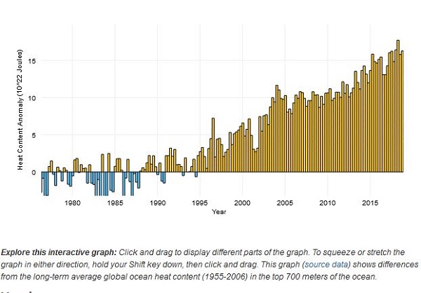
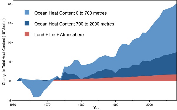
A few of the bars of the mid-1980’s have been cut off a little, but the message is clear. Here’s one from Dana Nuccitelli from a few years ago:
Third graph
As heat is distributed and the Earth system reaches equilibrium, some of the heat from the ocean will travel to the depths, but some will emerge to warm the atmosphere. So the third graph to watch is global surface temperature. NASA has an annually updated version. Here’s a screenshot:
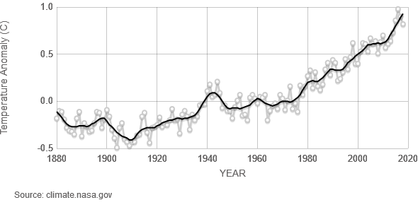
I prefer this one from Hansen et al Global Temperature in 2018 and Beyond:
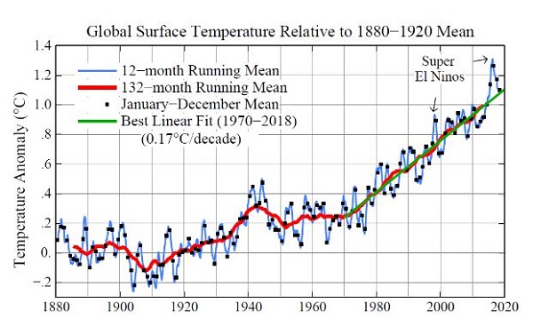
El Niño years tend to give rise to increases in surface temperature. The long term trend is clear, but if you look carefully, beyond the trendlines, warming tends to proceed in step-wise fashion. Climate scientist Roger Jones has shown that warming proceeds from events rather than gradual trends, and that we need to take this into account in managing risk. See other entries at his blog Understanding climate risk.
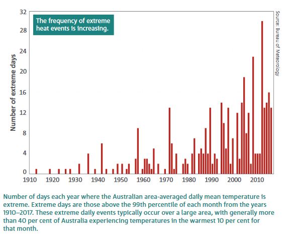
This step approach is important as to how we will experience climate change in the next century or so. We need to be mindful that significant risks can emerge from low-incidence, high-impact events, because there is much that we don’t know. The models give us smooth line projections, but we can be certain that the future will not conform to smooth curves. Also as responsible humans we need to take into account the longer term implications of our current actions now. As the surface temperature warms, other effects manifest themselves, such as from the CSIRO/BOM State of the Climate 2018 report, an increase in extreme heat events:
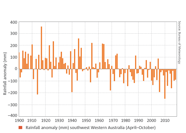
Changes in rainfall in southwest WA April – October:
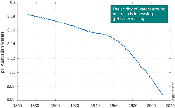
Changes in ocean acidity:
And changes in sea level rise:
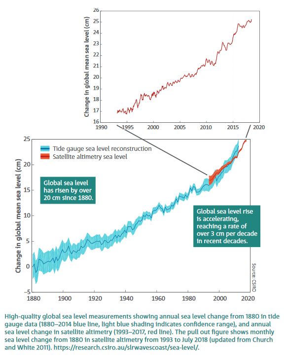
This graph from Hansen’s Nutshell (p. 25) show how CO2 levels, surface temperature and sea level move in concert in the longer term:
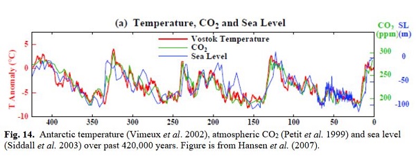
However, sea level tends to lag the other two. This graph, then, showing how CO2 has shot up compared to the last 800,000 years must be a worry:
Given that the effects play out over centuries, indeed millennia, we need to go back to the paleoclimate record and look at analogues to get some idea of the longer term implications of current emission levels. It is common now to say, as this NASA site does, that today’s levels of CO2 are similar to the Pliocene, when the global surface temperature was roughly 3 to 4 degrees Celsius warmer than today and the sea 5 to 40 metres higher.
In my 2013 post CO2 hits 400 ppm I noted that Michael Mann and Aradhna Tripati said we were getting back to the mid-Miocene, 10-15 million years ago. Tripati et al gave us this graph:

The point is that we are entering the zone where both Greenland and Antarctica are in play. In a paper by Levi et al Antarctic ice sheet sensitivity to atmospheric CO2 variations in the early to mid-Miocene they point out that the Antarctic ice sheet margins were highly dynamic during the early to mid-Miocene and sensitive to relatively small changes in atmospheric CO2 (between 280 and 500 ppm). That was 2016, and Tripati was one of the authors.
In the same year Aradhna Tripati, Christopher Roberts and Robert Eagle produced a paper Coupling of CO2 and Ice Sheet Stability Over Major Climate Transitions of the Last 20 Million Years:
- The carbon dioxide (CO2) content of the atmosphere has varied cyclically between approximately 180 and approximately 280 parts per million by volume over the past 800,000 years, closely coupled with temperature and sea level. For earlier periods in Earth’s history, the partial pressure of CO2 (pCO2) is much less certain, and the relation between pCO2 and climate remains poorly constrained… During the Middle Miocene, when temperatures were approximately 3 degrees to 6 degrees C warmer and sea level was 25 to 40 meters higher than at present, pCO2 appears to have been similar to modern levels. Decreases in pCO(2) were apparently synchronous with major episodes of glacial expansion during the Middle Miocene (approximately 14 to 10 million years ago) and Late Pliocene (approximately 3.3 to 2.4 million years ago).
Given that 3 degrees when added to current warming makes 4 degrees, which is held to be the point where civilisation as we know it is threatened, the implications are ugly, but we are some way from fully understanding them.
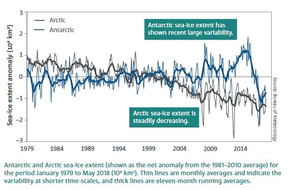
For example, Antarctic sea ice cover has plunged from 2014 levels after rising to that point, as shown in the State of the Climate report:
ABC RN recently broadcast a session Antarctica: What happens there matters everywhere which was recorded as part of the World Science Festival Brisbane on 22 March 2019. The huge lump of ice of East Antarctica is nearly 5 km thick at the maximum. I believe the average surface temperature is -37°C. As we go down lower, with pressure and closeness to the centre of the earth, the temperature rises. Under the ice on the bedrock there are over 200 lakes of water.
Much of the bedrock is below sea level. This is a graphic I have on file, but the true story is that the bedrock topography is still being mapped:
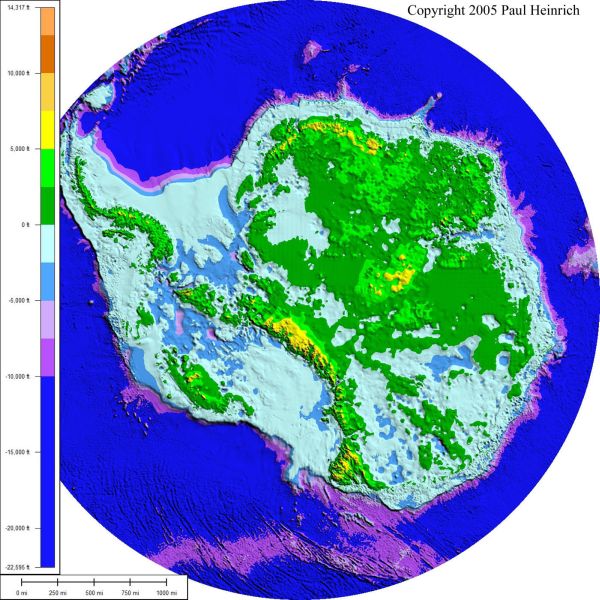
The blue and purple are below sea level. One could imagine the warm currents attacking the underside of the ice sheets for a very long time after CO2 levels are reduced. The heat is currently being forced into the ocean, but would leave in its own good time if we reduced CO2 concentrations.
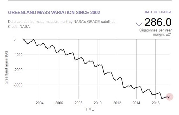
Stories such as Antarctic Sea Ice Declining ‘Precipitously’ Since 2014, Study Finds and Antarctica’s Ice Is Melting 5 Times Faster Than in the 90s are not what we want to hear. The last thing we need for a safe climate is ice sheets in play. Yet that is what we appear to have (from the NASA site). Greenland:
Antarctica:
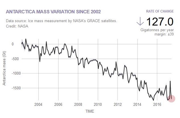
The Greenland ice sheet is worth 6-7 m in sea level rise, West Antarctica 5-7 m, and East Antarctica 59 m. With land glaciers and ice caps elsewhere at 0.5 m and thermal expansion the total is in the region of 75-80 metres.
Fourth graph
A fundamental problem is our habit of burning fossil fuels. Here’s the fourth graph from Makiko Sato and James Hansen (see Nutshell p. 49):
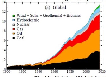
Kenneth Rogoff tells us that while the average age of coal-fired power plants is 42 years in advanced economies, in Asia the average is only 11 years, and a new one is being built every week.
Moreover, gas, which hasn’t been mentioned above, is much touted as a climate-friendly transition fuel, which is essentially a scam.
Declarations of ‘climate emergency’ notwithstanding, there appears to be an attitude that we can do climate mitigation without disruption. Remember we got 6-9 metres of sea level rise in the Eemian with 300 ppm. Ice sheet instability started right there.
For a safe climate we need need to dial down greenhouse gases urgently, which will be disruptive and involve stranded assets. That is another story.
See also:

Impressive, Brian.
I hear that some librarians these days call themselves “information navigators“.
Apt.
Thanks, Ambi. Yes librarians do. many want to retain attachment to liber, the book, but if they don’t modernise their moniker they risk irrelevance.
It’s about branding.
Many decades ago the Library Association of Australia became the Australian Library and Information Association. Generally they’ve been more nimble and successful in the transition than teacher-librarians in schools.
On the post, I probably should have stressed that as you look back in time, uncertainty grows. However, we have a pretty good handle on what happened since the dinosaurs karked it 65 million years ago.
The positioning of Antarctica is critical, and it has been where it is for 100 million years.
We are dealing with a complex system and each time we have deglaciation it turns out somewhat differently.
Risk is the thing. As uncertainty bands widen, the lower bound is still disastrous in the longer term.
“As you look back, uncertainty grows”.
True, as illustrated in the recent discussion here, of what archaeology currently tells us of hominids and their migrations.
Quite remarkable that modern instruments and geological methods (extracting ice cores, using satellite data) can give us a fairly accurate picture over the last 65 million years. Of course the observations are interpreted in ways that are theory-laden (interpretation must be done in accordance with current knowledge and understandings; but that’s true in every scientific enterprise and in every era.
Scientists do the best they can.
Sometimes they do magnificently well.
Now, if this planet is presently building up a very large heat bank in the upper levels of the oceans:
what are the implications for local sea temperatures and the biota living there?
implications for rainfall and storms? (evaporation rates from warmer oceans….)
implications for global cloud cover?
how much heat will mix downwards to lower levels, how much will warm the breezes over the oceans?
over what timescales will the stored energy pass back into the atmosphere? (how much breathing space might the energy storage in oceans have given us terrestrial creatures? including the monkey species looking on in horror as their distant nephews wreck the joint)
Ambi, most of those questions I can’t answer.
From memory it takes something like 100 years for a warming pulse to travel from the surface to the ocean floor.
On circulation currents, this site says it take 1000 years for water to complete the circuit of the Thermohaline circulation current.
From memory, it takes 50 years for a melting pulse from Antarctica to cross the equator.
In terms of climate stabilisation if we got emissions at a certain level, I suspect we are looking at 1 to 3 thousand years. That’s if tipping points are not tripped.
Not expecting you to answer those vague and broad questions, but I’m interested to learn what scientists are looking at, and finding. Will go digging.
I think we just got through a day without a comment. That’s possibly a record.
I’ve just seen an article with a comment by a paleoclimate scientist, who says that ‘ocean overturning’ happens on a timescale of 500 to 1000 years. Ice sheets once they become unstable take “a couple of thousand years” to reach a new equilibrium”.
Brian: My take on the Vostok ice core results you showed above suggest that we had just about reached the point where we would be going into an ice age. Has this been factored into your thinking?
Adani has requested a list of the names of the scientists who may be involved in providing environment approvals! Story has a heavy handed feel about it.
John, I don’t know what climate modellers put into their models, but I think the expectation was that without human-caused emissions we would have been soon heading towards an ice age.
There was only 100 ppm difference, ie. from 180 to 280. The relationship is not linear, so the next 100 ppm don’t cause as much warming as the 180 to 280 did. I don’t want to be more specific than that because you get into heavy duty science, which is where I can’t go.
James Hansen has said that our actions have cancelled the next ice age. I don’t think there would be any disagreement with that.
My main issue is that paleoclimate information perhaps provides more help in working out the future implications of 400 ppm + emissions than projecting trends based on a bit over 100 years of data.
John, I agree the action by Adani is heavy-handed, scary and preposterous.
Brian: If our heating and cooling cycles were simply orbit etc. driven you would expect the temp curves to be sinusoidal (or curves formed by summing sinusoidal curves.) However, what you see is a slow decline in both temp and CO2 followed by a sharp rise in both. My guess is that the decline is slow because it takes time to pack CO2/CH4 into peat bogs, the cooler sea etc. The rise is rapid because the rising temp drives CO2/CH4 out of the bogs etc rapidly. (More rapid than the packing because building up peat bogs etc takes time.)
There is plenty of permafrost etc to continue adding to temperatures that are still rising despite the orbits etc moving into a cooling phase,