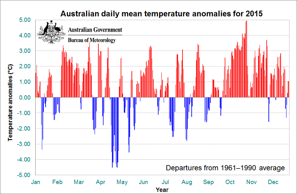
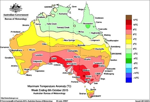
Subjectively 2015 seemed like a very hot year, so there may be some surprise to find that according to the BOM’s Annual climate statement 2015 it was only the fifth hottest year. That’s possibly because the October-December period was the hottest on record. There was exceptional heat early in October, with parts of Victoria being 7°C above normal. Nationally October was 2.89°C above the 1961-90 average, a record monthly anomaly.
This graph shows the hot spells for the year:
This graph (from this site) shows the monthly anomalies for the last five years:
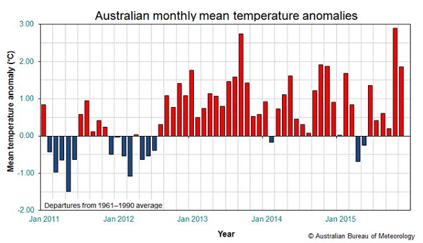
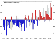
We can see that 2013 was consistently hot. In fact 2013 was the record year. 2015 comes in close behind 2013, 2005, 2014 and 1998, as we see in this graph:
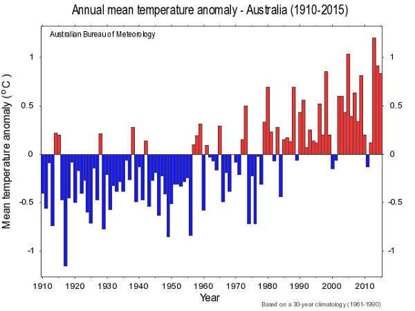
So 2013-2015 were three of the five hottest years. Eight of the 10 warmest years have occurred since 2002.
This map shows where the heat was in terms of deciles.
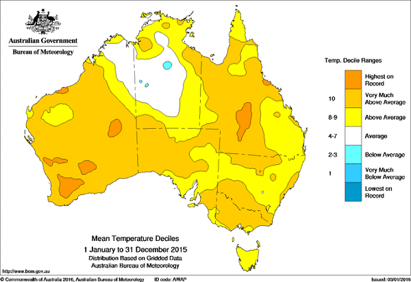
Much of the continent was either decile 10 or the hottest on record.
Rainfall
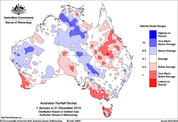
The Australian mean rainfall for 2015 was 5% below the 1961–1990 average, with the Northern Territory and New South Wales above average.
There were three significant dry areas – the southwest of Western Australia, much of Queensland, and an area in the southeast encompassing Tasmania, most of Victoria and much of the settled areas in South Australia:
Future
At Climate Central John Upton points out that in 2014 a flip was detected in the sluggish and elusive ocean cycle known as the Pacific Decadal Oscillation, or PDO. The shading in this graph represents cooler and warmer phases of the PDO against global temperatures:
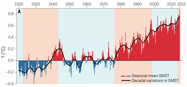
The black line represents the 10-year running average.
It is quite noticeable that warming took off in the mid-1970s. Then we had a slow-down from 1998, known as the “pause” that really wasn’t a statistical pause. It looks as though it may have stepped up a gear in the last couple of years.
- The record warmth set in 2014 was surpassed again in 2015, when global temperatures surged to 1°C (1.8°F) above pre-industrial averages, worsening flooding, heatwaves and storms.
As the article says:
- The effects of the PDO on global warming can be likened to a staircase, with warming leveling off for periods, typically of more than a decade, and then bursting upward.
“It seems to me quite likely that we have taken the next step up to a new level,” said Kevin Trenberth, a scientist with the National Center for Atmospheric Research.
There is some discussion about the validity of the PDO concept, or whether it is just a label reflecting the predominance of El Niños and La Niñas. Nevertheless the direction is up and the line seems to surge at times. Like now.
Elsewhere Blair Trewin, Climatologist at the BOM National Climate Centre, has a post at The Conversation, and he also features in the Radio National PM segment.
Update: I’ve added an image of the early October temperature anomalies from this post by two Australian scientists:

Most of the discussion on the Wild weather reaches to North Pole Thread is relevant to this post.
The answer is probably on the BOM site, but I always get lost there (or distracted) so I haven’t checked my intuition.
However, looking at the temperature anomaly charts it seems to me that if we used a different base, (say) 1931 to 1960 or even 1941 to 1970, the current anomalies would be even more pronounced – the “average” temperature we use to define our climate is actually creeping upwards. Of course I may be wrong, but it does seem a bit like the apocryphal frog in the saucepan.
zoot, I agree with you. I’d like to see a base of 1870 to 1970. However, I think the 19th century records are a bit shonky, so I’d go back as far as they think the records are valid and end at about 1970, after which the temperature seems to take off.
For those interested the Climate Council did a report The Burning Issue: Climate Change and the Australian Bushfire Threat late last year. They found that the global fire season had lengthened by by almost 19% between 1978 and 2013.
As a result bushfire seasons here and in the Northern Hemisphere increasingly overlap. We lease some of our fire-fighting aircraft from overseas, so there is a problem.
I recently found this in an earlier article on The Conversation
Val, there is an impressive graph in that link showing the hectares burnt annually. The graph takes off from 2002 and now the annual burn is more than double what it was then.
Perhaps some critical tipping point was reached.
Relevant to the discussion between you and zoot above, Brian, I looked at the Essendon airport figures again. As I think I mentioned, they are for two periods, 1940-72 and 2002 – present.
Comparing the mean January maximums, for the first period the average was 26.1, for the second period 27.2.
As previously discussed, even by 1940 there was probably some slight warming compared with the pre-industrial period, though it may not have been much. Of course comparing a period of 33 years with one of 13 years isn’t ideal, but it certainly fits with the general picture of Australia having warmed by over 1C already.