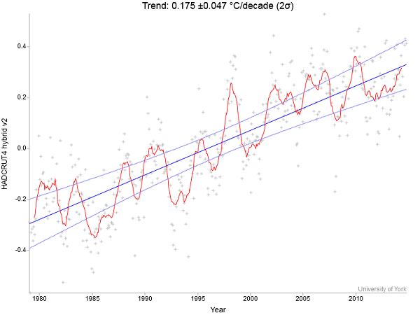
The bottom line is that statistically there never was a recent ‘pause’ or ‘hiatus’ in warming. If you ever thought there was you’d have plenty of company, but 2014 sees temperatures returning to the trend line.
At RealClimate Stefan Rahmstorf took a look at global surface temperatures since the satellite record in 1979. He used Kevin Cowtan’s interactive temperature plotting and trend calculation tool and HadCRUT4 hybrid data, which now has the most sophisticated method to fill data gaps in the Arctic with the help of satellites. This is what he found:

Rahmstorf then looks at some shorter intervals using more recent starting dates. He finds:
There simply has been no statistically significant slowdown, let alone a “pause”.
He then displays an analysis done for Realclimate by Niamh Cahill of the School of Mathematical Sciences, University College Dublin using a technique called change point analysis. This time GISTEMP data from NASA GISS is used from 1880 to the present. 2014 was represented by January to October data, the latest available.
The algorithm used sorts through the data looking for changes in the trend lines, which it finds automatically. This is how it came out:

Change points were found approximately at 1912, 1940 and 1970. The trend since 1970 is firmly in place.
Tamino at Open Mind took a look at the same data. People often cherry pick a starting date so using a different statistical technique he examined whether there had been any change in trend starting from any year between 1990 and 2008. Often people choose a data set that suits their argument so he ran the technique over all eight commonly available data sets.
He could find no trend change – not even close.
I repeat: not only is there a lack of valid evidence of a slowdown, it’s nowhere near even remotely being close. And that goes for each and every one of the 8 data sets tested.
He then plots the GISTEMP data from 1970:

It’s all happening between the trend lines. Of course there are fluctuations, but none of significance. Not yet.
For a time the Hadley data simply left out the Arctic area where there are no weather stations. Of course the Arctic is warming faster than lower latitudes and it came to a point where this mattered. Recently they’ve corrected this by using satellite data, not directly, as the satellites measure the troposphere rather than the surface. I gather the satellite data is used comparatively to infer the surface temperature across the Arctic.
Looking back over the archive, there was a study by Cowtan and Way (see RealClimate and Climate clippings 89, Item 4) which compared the HadCRUT4 data of that time with ‘filled in’ data. This is how it looks:

Notice how the heavier corrected lines make 1998 a little cooler and recent peaks a little warmer.
Even so, I recall that Ross Garnaut in preparing his report about five years ago asked two leading statisticians to examine the trends. They said the long term warming trend was still in place. Seems they were right.

